Time Series - the basics#
This tutorial focuses on working with basic time series data management and analysis using plans.
Notebook setup#
For users running this tutorial as a Jupyter Notebook, this cell must be executed first:
import sys
from pathlib import Path
import pprint
import numpy as np
import pandas as pd
import matplotlib.pyplot as plt

# Install `plans` in `google.colab`.
# Use `pip install plans` for other environments.

if "google.colab" in sys.modules:
    import os
    os.system(f"{sys.executable} -m pip install -q plans")

# This avoids warnings related to uninstalled fonts
import logging
# Set the matplotlib font manager logger to only show errors (hides warnings)
logging.getLogger('matplotlib.font_manager').setLevel(logging.ERROR)

# define output folder
OUTPUT_DIR = Path("outputs/time-series")
OUTPUT_DIR.mkdir(parents=True, exist_ok=True)
print(f"Outputs will be saved to: ./{OUTPUT_DIR}")
Outputs will be saved to: ./outputs/time-series
The TimeSeries object#
The TimeSeries object is a very primitive class that lives under plans.datasets module.
This object is a child from the Univar object that lives in plans.analyst module.
The TimeSeries stores all core methods for working with time series, incluing standardization.
Import TimeSeries object:
from plans.datasets import TimeSeries
Create an instance of the TimeSeries:
ts = TimeSeries(name="Testing", alias="tst")
Check out the ts variable type:
print(type(ts))
<class 'plans.datasets.core.TimeSeries'>
Attributes work the same way as in the Univar object:
ts.units = "cm"
ts.description = "Just a tutorial"
print(ts)
[Testing (tst)]
TimeSeries (DS):	<class 'plans.datasets.core.TimeSeries'>
                   field           value
                    name         Testing
                   alias             tst
                    size            None
                   color          orange
                  source            None
             description Just a tutorial
                   units              cm
                    code            None
                       x            None
                       y            None
          variable_field               v
           variable_name        Variable
          variable_alias             Var
      variable_range_min            None
      variable_range_max            None
            variable_min            None
            variable_max            None
          datetime_field        datetime
           datetime_freq            None
            datetime_res            None
                   start            None
                     end            None
             is_standard           False
                gap_size               6
                 n_epoch            None
            n_gaps_small            None
file_data_datetime_field        datetime
file_data_variable_field               v
               file_data            None
Data:
None
Working with perfect data#
A perfect data for time series means that there are no time gaps, so it does not need standardization.
Create synthetic time series data#
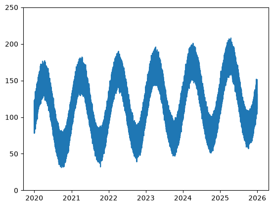
Lets first make a perfect time series using .make_synthetic_tsn() method and save it to a CSV file.
This method makes a Trend-Seasonality-Noise archetype time-series:
# make synthetic TSN (Trend-Seasonality-Noise) time-series
df = TimeSeries.make_synthetic_tsn(
    start="2020-01-01",
    end="2026-01-01",
    base=100,
    freq="3h",
    trend=0.002,
    noise_sd=3.0,
    amplitude=50,
    seasonal_period="YS",
    minor_amplitude=20,
    minor_seasonal_period="D"
)

# Export CSV file
file_csv = OUTPUT_DIR / "time_series.csv"
df.to_csv(file_csv, sep=";", index="False")
print(f"Saved to: {file_csv}")
Saved to: outputs/time-series/time_series.csv
The whole time series looks like this:
# get simple visualization
plt.plot(df['datetime'], df['level'])
plt.ylim([0, 250])
plt.show()
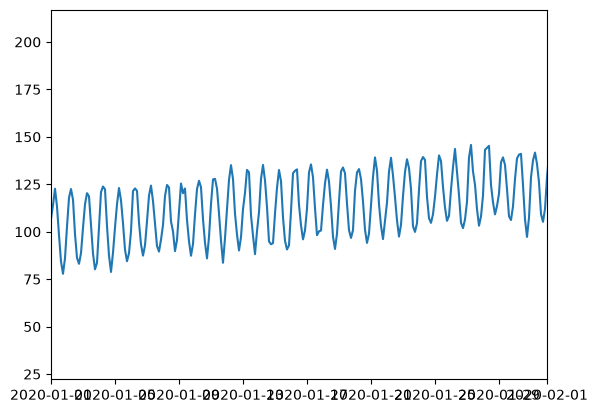
A zoom to the month scale:
# get simple visualization
plt.plot(df['datetime'], df['level'])
plt.xlim(pd.to_datetime(["2020-01-01 00:00:00", "2020-02-01 00:00:00"]))
plt.show()
Loading data from the CSV file#
Call the .load_data() method for loading from CSV file:
# reset the ts variable
ts = TimeSeries(name="Testing", alias="tst")

ts.load_data(
    file_data=file_csv,  # file path
    input_dtfield="datetime", # name of datetime field
    input_varfield="level",  # name of variable
    in_sep=";",  # input separator
    filter_dates=["2020-01-01", "2020-03-01"]  # filter dates
)
Data is stored in the .data attribute:
ts.data
| datetime | v | |
|---|---|---|
| 0 | 2020-01-01 00:00:00 | 106.727694 |
| 1 | 2020-01-01 03:00:00 | 113.964091 |
| 2 | 2020-01-01 06:00:00 | 122.674962 |
| 3 | 2020-01-01 09:00:00 | 113.328783 |
| 4 | 2020-01-01 12:00:00 | 98.232477 |
| ... | ... | ... |
| 475 | 2020-02-29 09:00:00 | 158.838695 |
| 476 | 2020-02-29 12:00:00 | 145.522001 |
| 477 | 2020-02-29 15:00:00 | 134.640271 |
| 478 | 2020-02-29 18:00:00 | 126.071063 |
| 479 | 2020-02-29 21:00:00 | 129.683225 |
480 rows × 2 columns
Visualizations#
Most plans. objects comes with built-in methods for getting visualizations, both inline and figure output.
See also
Check out more about visualizations on the Visualizations - the basics tutorial.
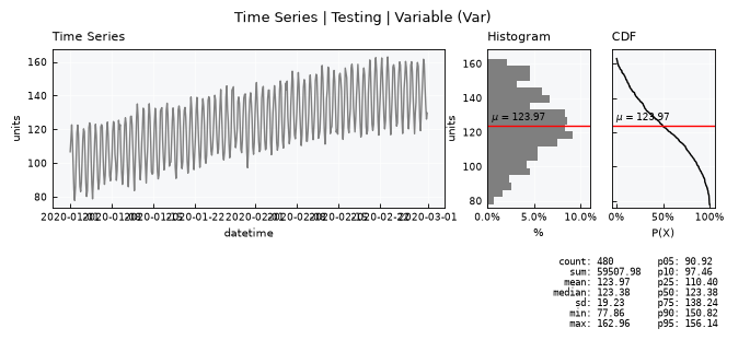
Standard visualization#
Get the standard visual using the .view() method
ts.view()
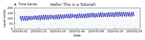
Fine-tuning visual items#
Fine-tune plot specs by editing the .view_specs attribute dictionary
# reset view_specs
ts._set_view_specs()
# edit specs
# color of the main line
ts.view_specs["color"] = "blue"
ts.view_specs["color_hist"] = "green"

# Style of line
ts.view_specs["drawstyle"] = "steps-mid"

# Labels
ts.view_specs["ylabel"] = f"Level ({ts.units})"
ts.view_specs["xlabel"] = "Date"

# Titles
ts.view_specs["title"] = "Hello! This is a Tutorial!"
ts.view_specs["subtitle_data"] = r"$\bf{a}$  Time Series"
ts.view_specs["subtitle_hist"] = r"$\bf{b}$  Histogram"
ts.view_specs["subtitle_cdf"] = r"$\bf{c}$  CDF"

# Axis
ts.view_specs["range"] = [0, 200.0]

# Number of dates in the X axis
ts.view_specs["n_dates"] = 7

# Call view() again
ts.view()
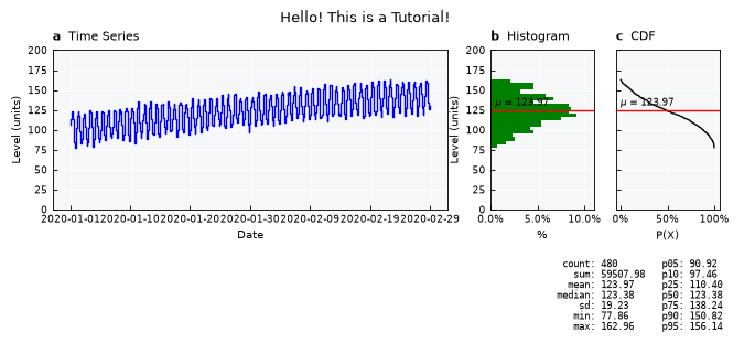
Layouts available#
List available layouts:
print(ts.layouts.keys())
dict_keys(['full', 'mini', 'simple', 'simple-shallow', 'default'])
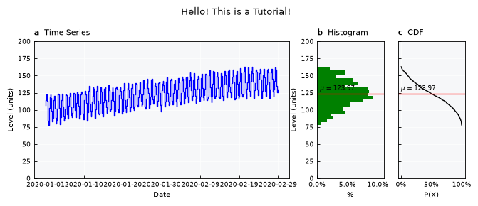
ts.view_specs["layout"] = "full"
ts.view()
ts.view_specs["layout"] = "mini"
ts.view()
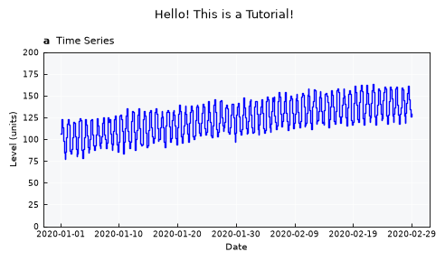
ts.view_specs["layout"] = "simple"
ts.view()
ts.view_specs["layout"] = "simple-shallow"
ts.view()